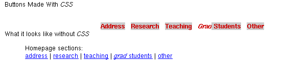
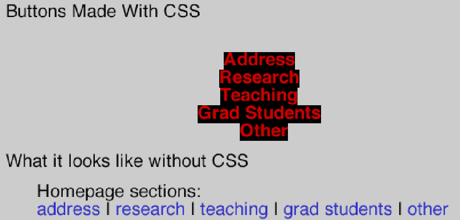
Screen Shots
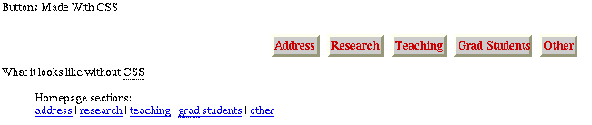
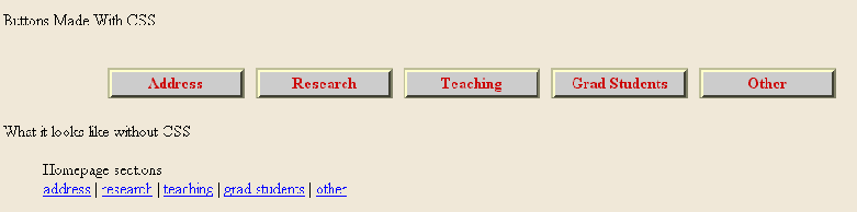
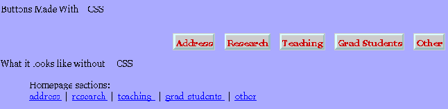
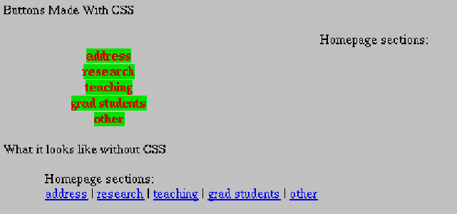
Here are samples of how four common graphical browsers (and two
uncommon ones) display the menu. The four common browsers are: Mozilla, Internet Explorer, Opera, and Netscape.
The uncommon browsers are Konqueror and WebTV.
After the screenshots are some questions (and
possible answers) for you to think about.
The alt attribute of the img elements
has detailed descriptions of the images. You can also read those
longer descriptions by following the [D]
links to the alternate version of this webpage.
 [D]
[D]
 [D]
[D]
 [D]
[D]
 [D]
[D]
 [D]
[D]
 [D]
[D]
The screen capture is from the WebTV simulator version 2.6 (from the former
developer.msntv.com website).
For another comparison of how well certain browsers support CSS see WestCiv's CSS Compatibility Guide.
- Q:
Which one of the above is the correct presentation?
- A:
Netscape 4, Konqueror, and WebTV are very
different from what the author intended.
Although some of the presentations are more like what the author
intended, there is no single correct presentation because on the
WWW authors cannot always
know what software their webpages will be viewed with.
- Q:
What can WWW authors do to make their webpages
appear more like they intended?
- A:
In computer science we are often more concerned with the content of
the message and not the presentation. We don't want the
presentation to be ugly or confusing but we usually care much more
about the content.
If the format of the presentation is very important then there are
a few things we can do, including:
- realizing that not everyone will be able to view our content the
way we want them too (for instance: people viewing the web on cell phones
and non-human search engines) we concentrate on markup that should
be presented in a reasonable manner even if the presentation
details cannot be rendered.
- hope that users of browsers that do mangle CSS will deactivate
the CSS use in those browsers.
- use CSS (or JavaScript, or both) to inform
readers of the Browser Upgrade Campaign of The Web Standards Project with the hope that people will
stop using those browsers.
- Version:
- 10 October 2002
- CS 3172 Prof.:
- J. Blustein
<jamie@cs.dal.ca>
 &
& .
.
